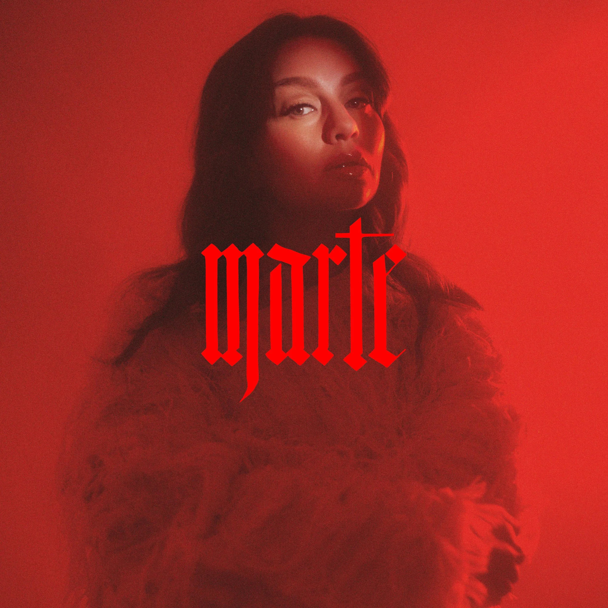
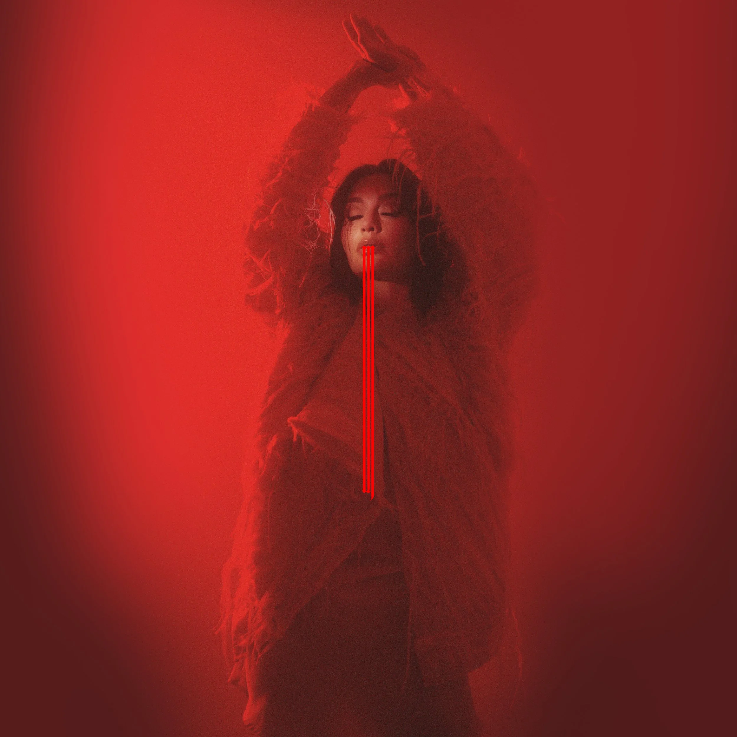
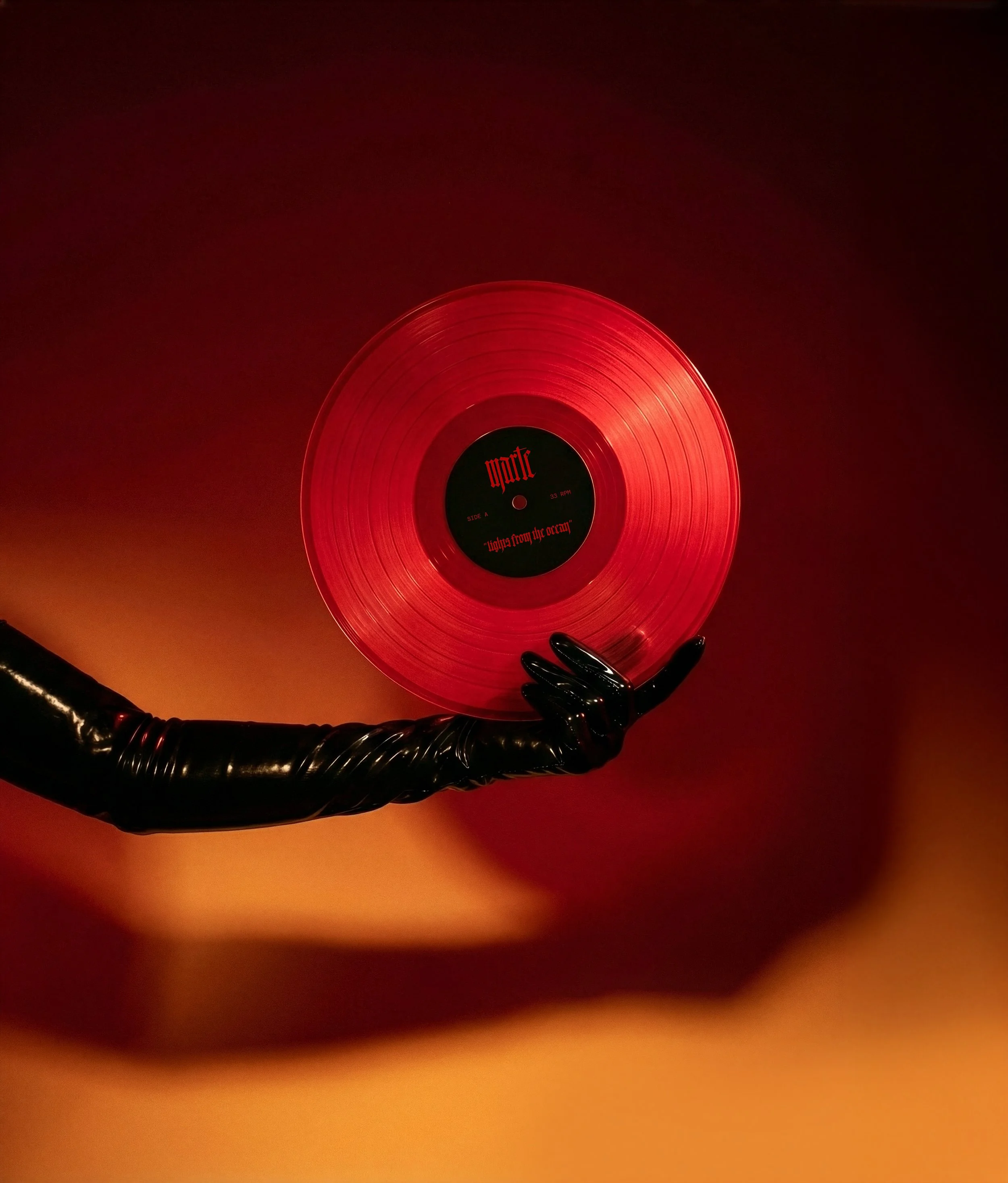
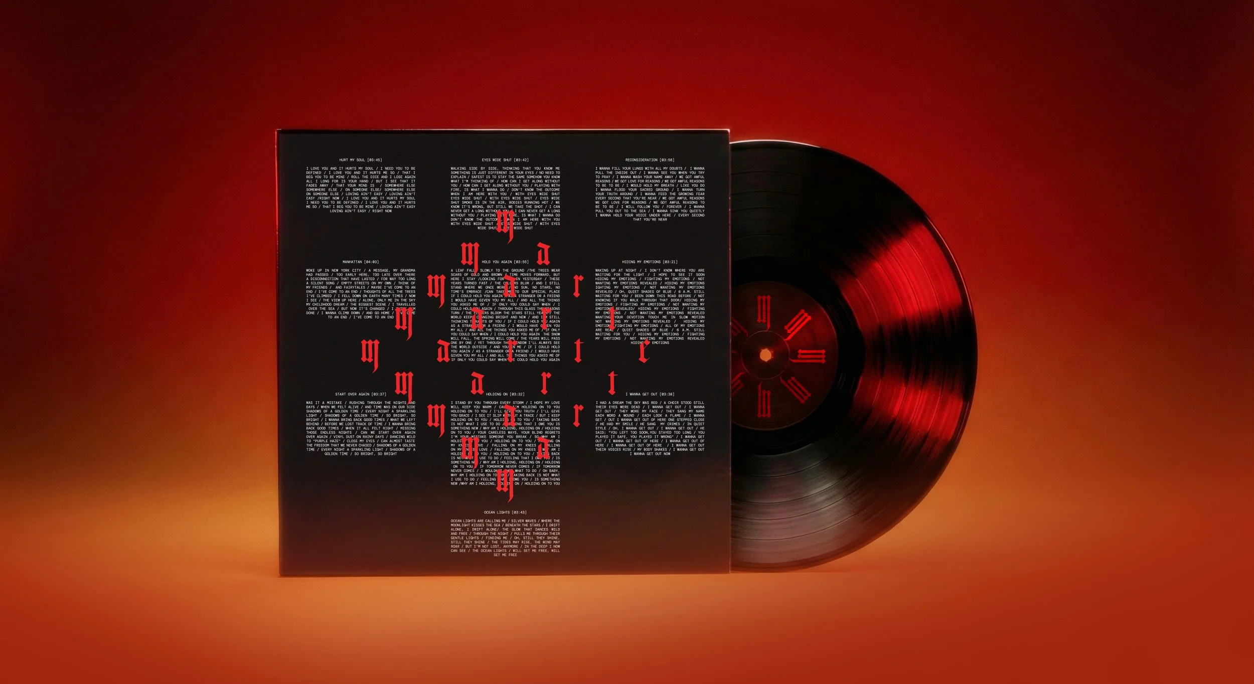
Marte’s Light From The Ocean
Lights from the Ocean set the tone from the very beginning. The title suggests depth and distance, light cutting through darkness, somewhere far below the surface. That imagery became the foundation for a cinematic visual universe defined by contrast, tension, and atmosphere.
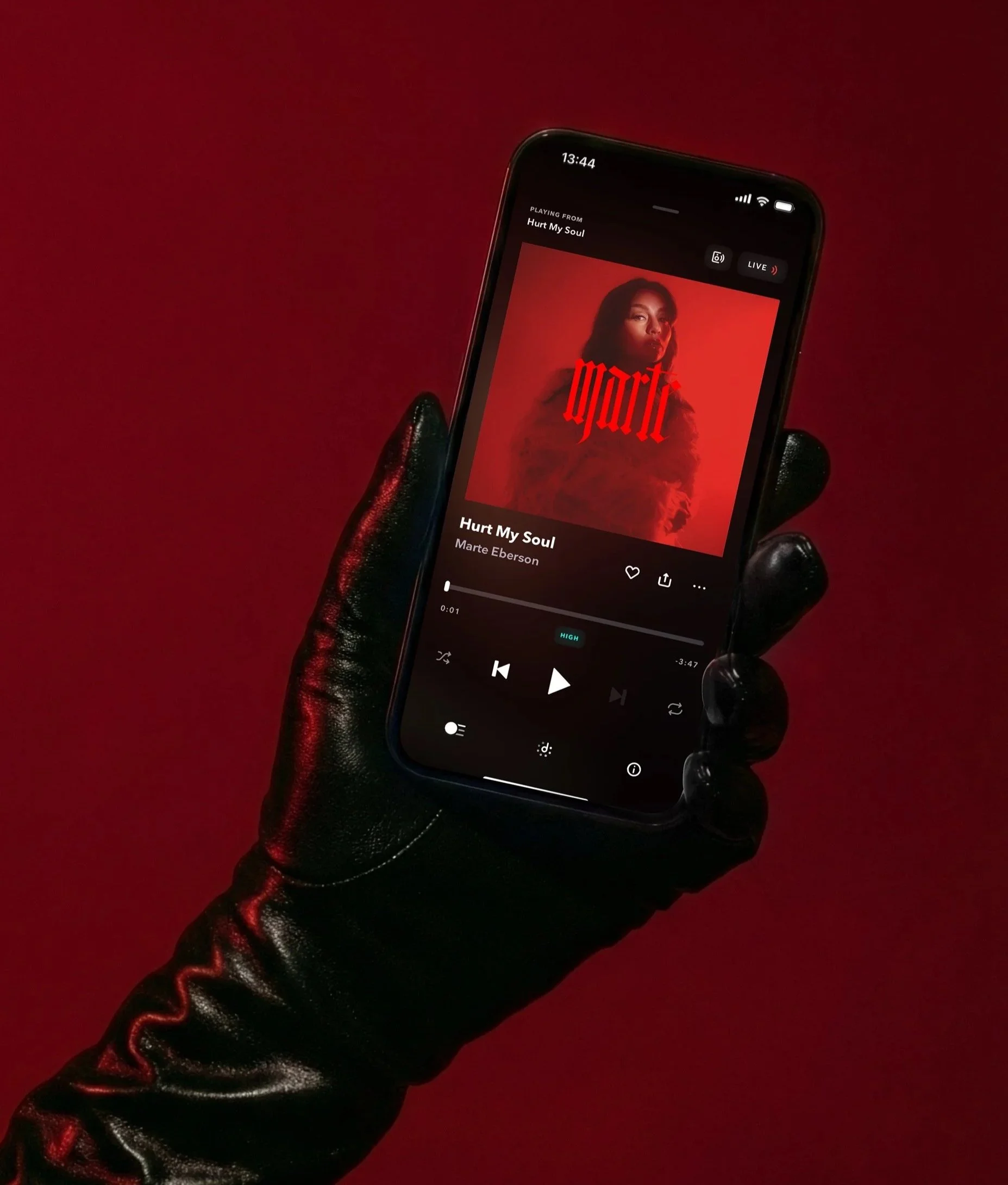
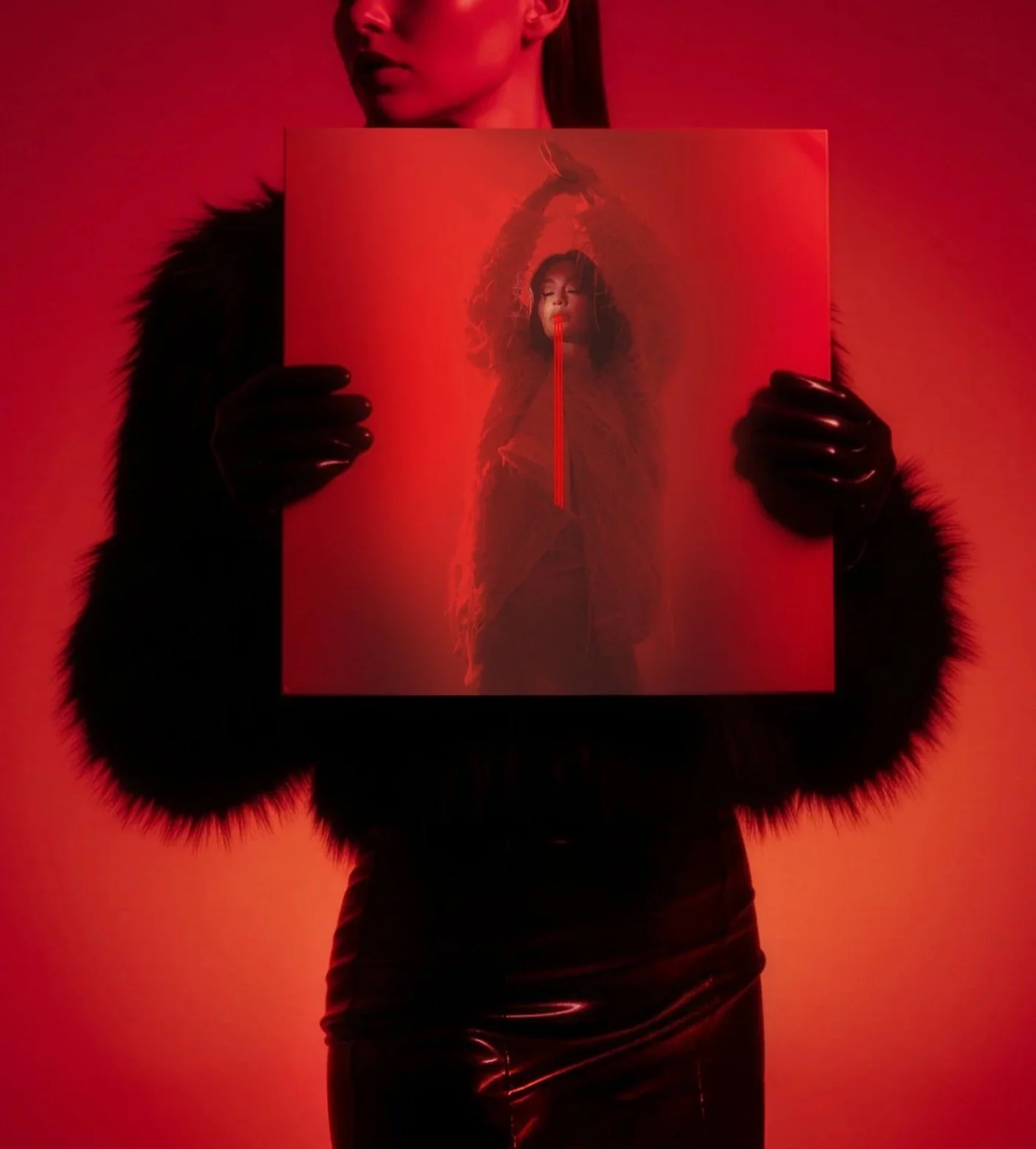
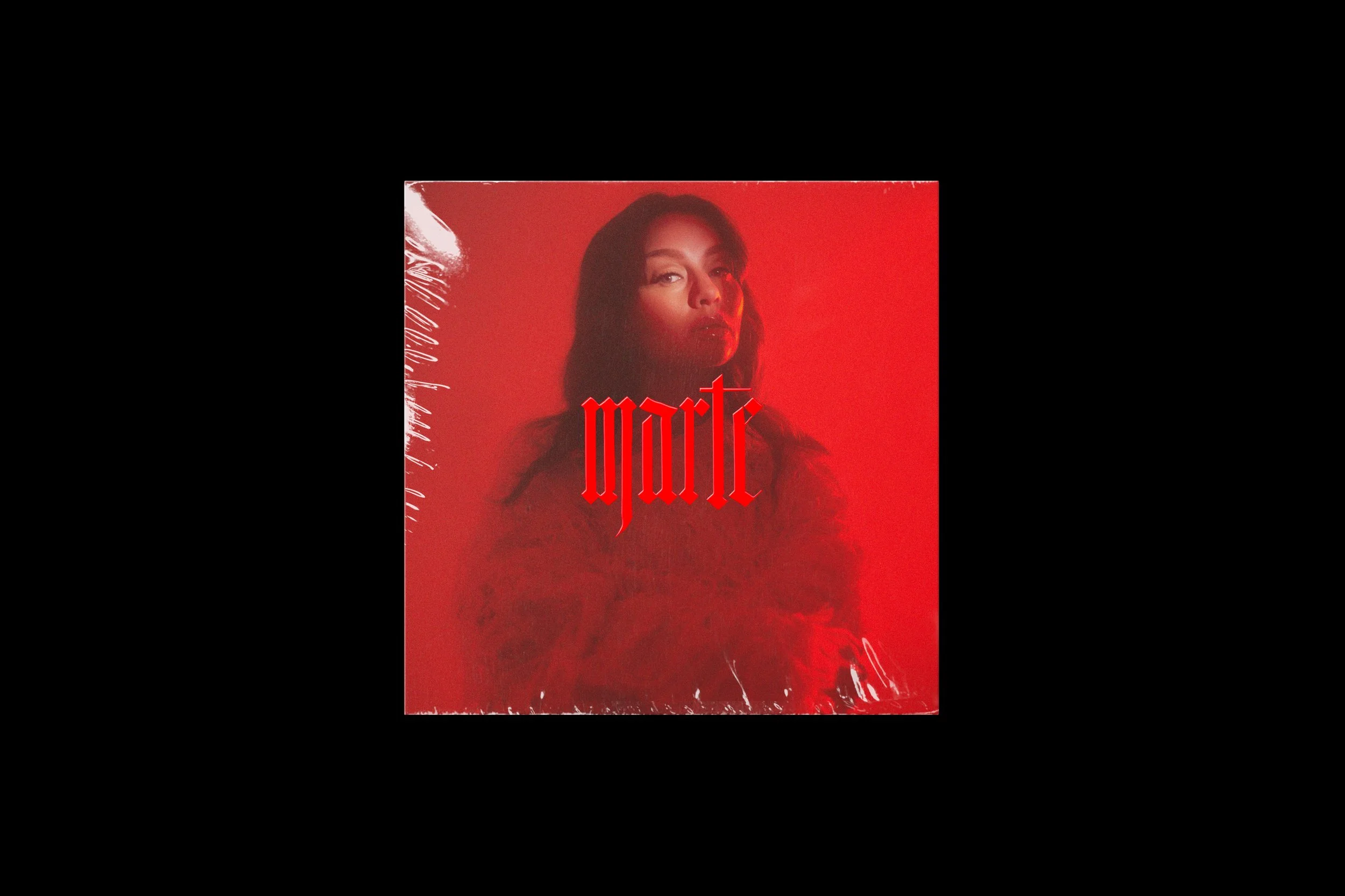
The artwork unfolds in a dark, sensual palette of red and black, with Marte in the center of it. Evoking both intimacy and unease. Experimental typography moves between precision and expression, mirroring the music’s emotional shifts and raw energy. While the album lives within rock and pop genre, the visual identity explores the deeper currents beneath, where shadows linger and emotions feel heavier, slower, and more powerful.
It’s a world where beauty and darkness coexist, illuminated only by fragments of light from the ocean below.
Brand Identity
Art Direction
Packaging